The impact of the COVID-19 pandemic continues to reverberate around the world, affecting how we live, love and work. One obvious impact on work has been the large number of people working from home (WFH) during various ‘lockdown’ arrangements. WFH rather than being in the office (ITO)—where this is a possibility, which does not apply to all jobs, of course—is a complex change and also a topic of considerable debate: a quick Google search on the term working from home currently yields around 3.4 million results and numerous articles have recently appeared offering sets of principles or rules to guide individuals or companies where WFH has become important. As the pandemic unfolds through various waves, adaptations have been developed (e.g. ‘shifts’ where some are ITO and others WFH, switching through a cycle) and research has explored—with contradictory results—whether WFH increases or decreases productivity.
Much current writing is thoughtful yet ‘common sense’: it doesn’t think through how the findings might be understood conceptually. This short series of posts sets out to remedy that, starting with this first piece that offers a simple conceptual grounding.
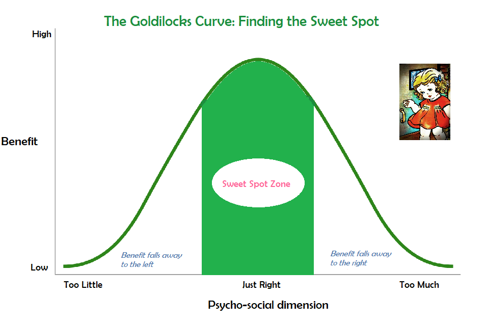
Which brings me to Goldilocks. Almost everyone knows the fairy story about the little girl, the three bears and her repeated discovery (for porridge, beds and so on) that a common pattern is three options—one is too little, one too much and one just right. This simple idea has enormous purchase in social life. In a myriad ways, we find that the level of benefit (individually or collectively) flowing from some variable or dimension fits inverted U curve as shown in this diagram. Shift left or right away from the sweet spot and benefit falls away. While this seems obvious in this context, think how often this picture clashes with straight line thinking. In the latter case more if better (or less is better) without limit. If some supervision is good, more supervision is better. If some accountability it good, more accountability is better.

In the real world, few of these linear relations hold. Almost always, as the line rises you run into a limit after which it tilts back down. I learned this years ago in studying mental health data. The literature suggested that people who had no involvement in voluntary organisations had lower mental health than those with involvement, and that as the number of involvements rose, so did mental health indicators. However, this only held to a moderate level. When you looked closely at the (very small group of) people with very numerous involvements the indicators fall away—it was “too much of a good thing”.
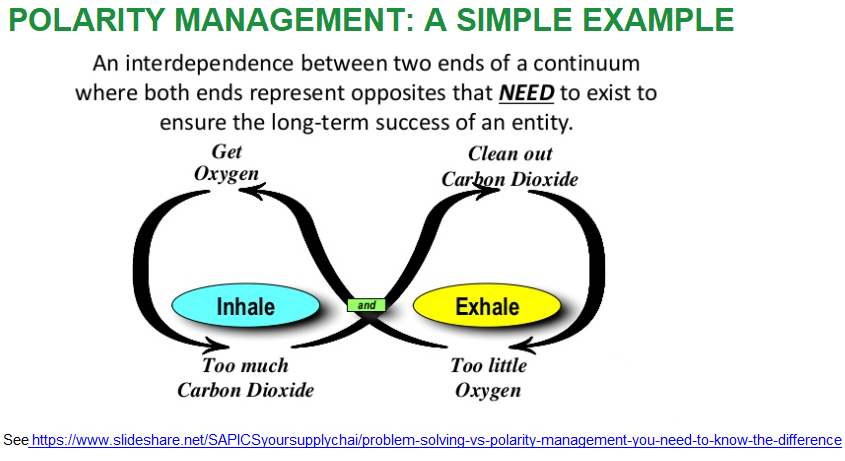
This brings me to the second, linked conceptual point: the dynamic that underlies staying in the sweet spot zone often arises from managing polarities. That is, not thinking we want all of A and none of B, nor all of B and none of A, but rather the good parts of both. This second diagram offers a simple illustration. We need to inhale and exhale and we need to balance the two processes to sustain a healthy oxygen supply.

Using the mental health example, to be mentally healthy, we need some involvement in voluntary organisations but not too much.
This model is easy to understand, I believe. In the next few posts I’m going to explore a series of polarities (Polar(ity) Bears, if you like!) to consider how to better understand what we know about the ITO/WFH contrast and how to manage it well.

